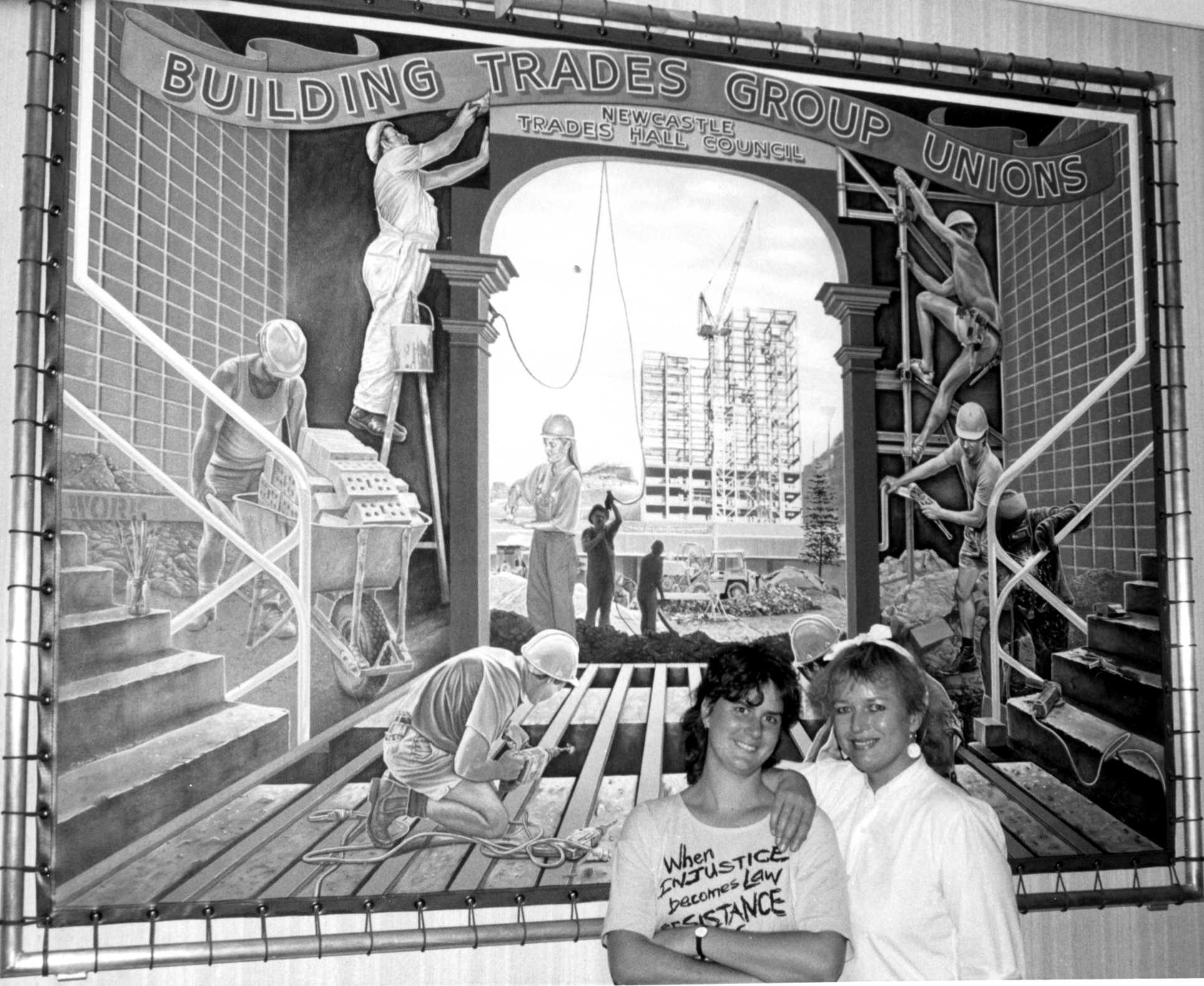
Jane Brisly and Birgitte in front of Building Trades banner at the launch 1986
1990 In 1989 an earthquake in Newcastle destroyed the Newcastle Workers Club and Trades Hall with a substantial loss of life. The May day specific issue banners and floats were also destroyed.Volunteers rebuilt the frames and I painted fifteen new "Issue" banners for May Day.This is one of them.
While doing these my taste in themes were stretched and one particular bad one was left to me to carry and was featured in the local paper. Well it was bad when I look back and was deserving of me to be memorialized with it. Among the good some bad ones can slip in. I don't know if any of these survived, or if they went the way of all temporary banners and were painted over the next year.lol.
The last I heard it was missing in action but probably still loved. New amalgamations, new hostility and the banner was "rescued from the office to hang "somewhere" I heard it was well looked after but that was a few years ago. Anyone know where it is today? Photography Russell Marlowe - B.Hansen
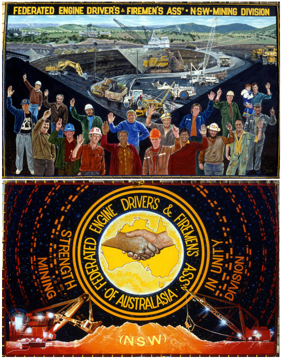
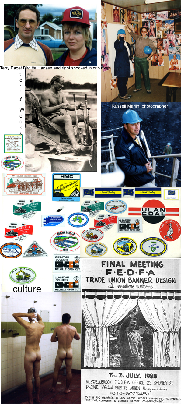
Report 1988 “Federated Engine Drivers and Fireman's Association". Mining division .
Artist Birgitte Hansen. Photographer Russell Marlan 8th October 1988
Banner Committee. John Thorley Russell Trappell John Sledzianowski Paul O’Connell Andy Sumner Eddie Wilton Arnies Rankin Terry Paget.
Details from Terry Paget’s Report from this time. Page 1
F.E.D. & F.A. BANNER PROJECT
REPORT
The F.E.D.& F.A.’s attempts to have a banner painted started in 1986.
These efforts were in the main, carried out by the W.C.A.C. arts officer Laural Quillan initially, and for the major and successful part by Jane Brisley. Jane especially is to be complimented on the professional and dedicated approach exercised in the procurement of funding assistance for the project. Secondly, and most important, for the guidance and information supplied to our banner committee. To this arts officer we are truly grateful.
We also wish to thank John Robinson and Glenn Beatty for their support as W.C.A.C. arts officers, having taken over from Jane in later stages, handling finance administration. The actual project commenced after discussions between Gitte Hansen our artist, John Robinson and banner committee members. It was decided that the F.E.D. &.F.A. would have one of its own members, Russell Marlan, (a plant operator at Bayswater Power Station) do the photography, he along with Gitte Hansen and Terry Paget (F.E.D. Member and plant operator) would do a tour of the mines. Terry being chairman of the banner committee and having local knowledge of the mining industry and area’s to act as guide.
The research inspections and talks were carried out over a period of two weeks, with many union activities, on site discussions and engine drivers working in their normal job environment. The engine drivers involvement in the industry covers a broad area demonstrating many varied skills, ie winder drivers in underground mines, water pumping, some ship loading facilities, coal washing and crushing plant ( coal preparation plants) various types of earthmoving equipment, bulldozers, excavators, shovels, draglines, scrapers, graders, dump trucks, loaders trailing cable handling machinery, rollers, dredging equipment, cranes, fork lifts, fuel tankers, service trucks and the operation of locomotives on mine sites.
.All these operations and machinery were viewed and photographed along with discussions with the operators.
The research group also had the opportunity to visit one of the very first coal mines established, most certainly the first open cut in NSW. In addition a retired engine driver Mr. Eddie Wilton, (committee member) accompanied us on a tour of this historical mine, Eddies’ having worked there in the early 1940’s.The management had retained an excellent collection of photographic history of the mine over the many past decades giving a rich and valued glimpse of our members past. As a result of this extensive research we found that we not only had a comprehensive collection of varied materials, but we had also gathered together an extensive photographic collection of our own union members and their activities, this in itself is invaluable.The research completed, Gitte set about drawing up a design proposal. Subject matter for the design was determined at a social meeting called for all interested F.E.D members and committee at a wine and cheese evening at the Percy Hotel. Singleton.The design presentation was, in general form, accepted with only minor changes. The committee complemented Gitte on the lay-out of the design, and her unique ability in under standing and communicating with the rank and file, demonstrating an affinity with the union movement. The results of this ability can be seen clearly in the expression of her work.The banner was completed on approximately October 10.1988, throughout the painting period regular visits by committee members were made, checking and notifying Gitte of any minor or technical changes.
The opening exhibition was planned for Singleton on October 28th 1988, 7pm. A wine and cheese evening with banner and photographs on display. We were also fortunate in having Melbourne Workers Theatre Group perform on the evening. The exhibition was done in conjunction with the Singleton Arts group and the Singleton Camera Club. All members of the community were invited to attend. The opening proved successful with members of the rank and file supporting the exhibition well. F.E.D members travelled as far away as Gunnedah and Mudgee with the state and Federal executive members of the union also present. In his address, the state organizer for the coal industry Mr. John Thorley stated that Gitte's Hansen’s efforts in producing the banner were widely acknowledged and appreciated by the members of the F.E.D.& F.A., concluding that Gitte’s many Hunter Region Union Banners have provided a lasting record of workers and their occupations.
The theatre Group was extremely popular giving a fitting launch to the banner. Our banner is now installed in our Muswellbrook office along with the collection of catalogued photographs taken. T.C Paget - Chairperson. Banner committee.
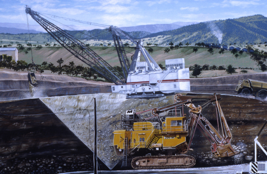
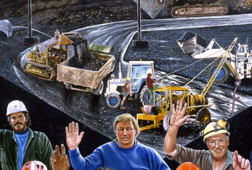
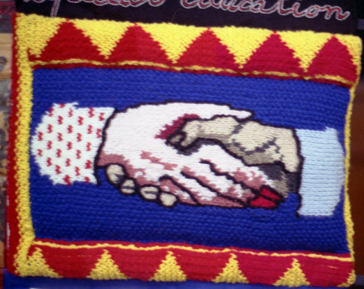
My report form this time.F.E.D. & F.A. The symbol for the F.E.D. & F.A. is two shaking hands inside a map of Australia, with the lettering in a circle and a scroll at top.The union and I decided to expand on this at a banner design meeting and I had wanted to do a night scene for a while. The mine work 24 hours a day and it was a way of describing this. The brilliance of Industrial night time lights have fascinated me since living in Newcastle and when travelling up the valley at night , you see the dark stormy night, the occasional town and farms, suddenly you encounter the eeriness of a mine working , the great lighted machinery light up like great lighted dinosaurs slowly gobbling at the rock face. The triangles and Pyramids of the muck heaps. This side was also meant to be as dramatic as possible as a contrast to the front and day scenes. I was influenced by the sticker that each mine and unionist puts on their hard hats and we have discussed having a simpler version being made into a sticker for the union. Many of these men are great collectors of these stickers and there is a lot of swapping between the mines. The design came from a meeting of the banner committee. The basic ideas came from me at this meeting as the night progressed. Photographic work was directed to this aim I had said that the union was about members and that one with just machinery would be about the owners and manufacture of these machines not members and would determine the message. I had been thinking about this aspect since we had first talked about 2 years previously. By having the men voting “Yes” for the union we put them first. I was given a list of machines and operators they wanted covered. They wanted an acknowledged historical content and of the start of the F.E.D. & F.A. from the early PowerStation’s. The open cut was designed as a composition from many mines sites and photographs and was given the “S” shape to lead the eye into the picture. The background landscape was based in Muswellbrook.
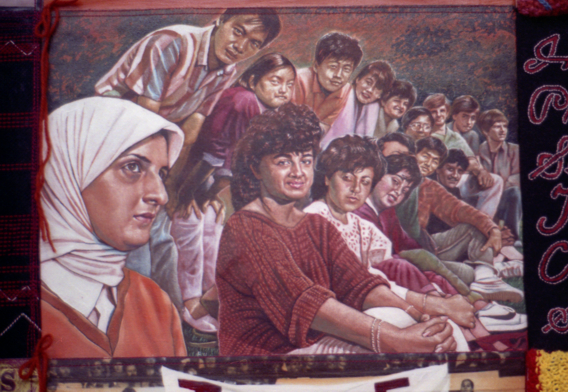
I composed this side out of 34 separate photos and it was certainly a challenging and ambitious design. To keep the scale, light coming from same angle, machinery actually sitting on the roads and hills and in scale. I had a good understanding of the layout of mines from my research trips and so was able to make up a site; it is not intended to be “real” but a rendered landscape comprising many aspects of the industry. There where often changes when it did not “sit” right .Terry came to my studio regularly and we discussed changes, scale, machinery ect. He always reported back to the committee for approval. When I first showed the first design drawings people were not sure of this side. It was still raw and I had to change and rearrange machinery. The men were also arranged to form a semi circle to unit with the “S “shape of the background. We photographed members from mines all over the state so we could get a mix of members. They were chosen on ages jobs race district mines. The historical material was supplied by members. At the oldest open cut mine at Muswellbrook, they had an extensive photographic collection and they arranged for us to have copies of some of these. The black blue and yellow is the colours of the union. I now have an extensive collection of research photographs and photocopies of historical material which I have made into books, one for me and one for the union. B.Hansen.
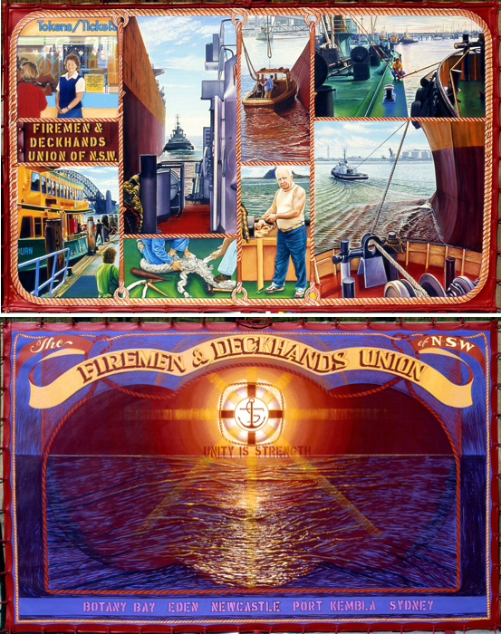
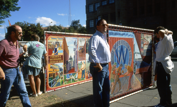
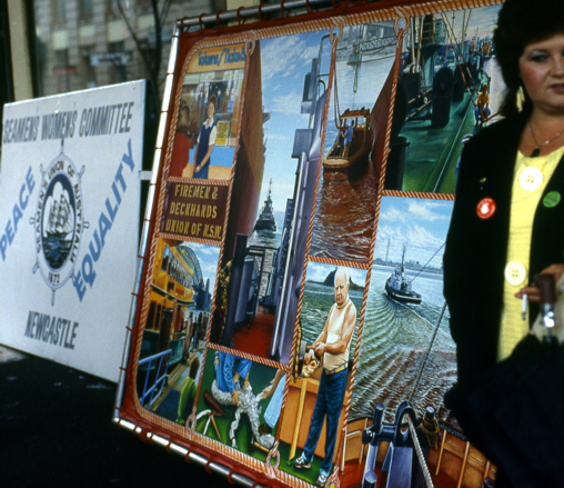
1986 "Fireman and Deckhands Union". NSW Branch Double sided. 2.5 x 1.8
This banner was George Sewell's reward for all his knotting and stringing of my banners. George and I were from the same suburb of Carrington and we were foundation members of that residence group. He was a ex seamen who now worked on the tugs in Newcastle harbour. He took Jane Brisley and I on a lovely day on a tug being part of a working industrial harbour. The man prominent was a ex official who had recently died and was much loved and respected. We saw a boolard pull which was a test of the strength of a new tug and saw the immense strength and power of a tug, along side of a huge ship. I went to Sydney and traveled the ferries. Ropes and the skills of roping are a big part of a deckmen's life and so was a feature. For me I have memories of laughing with mates sunlight water and enjoying the experience. The golden section was used to divide the space. I liked the back - the simplicity of the design and the nautical feel of this image inspired by the old seamans' banners. Sometimes it became very challenging to come up with new ideas and how to put together multiple images and histories into one picture. For a while I used the golden section then I pulled back from just placing separate images to form the design. I felt it was not exciting and a cop out. Photography - Jane Brisley - Birgitte Hansen - .
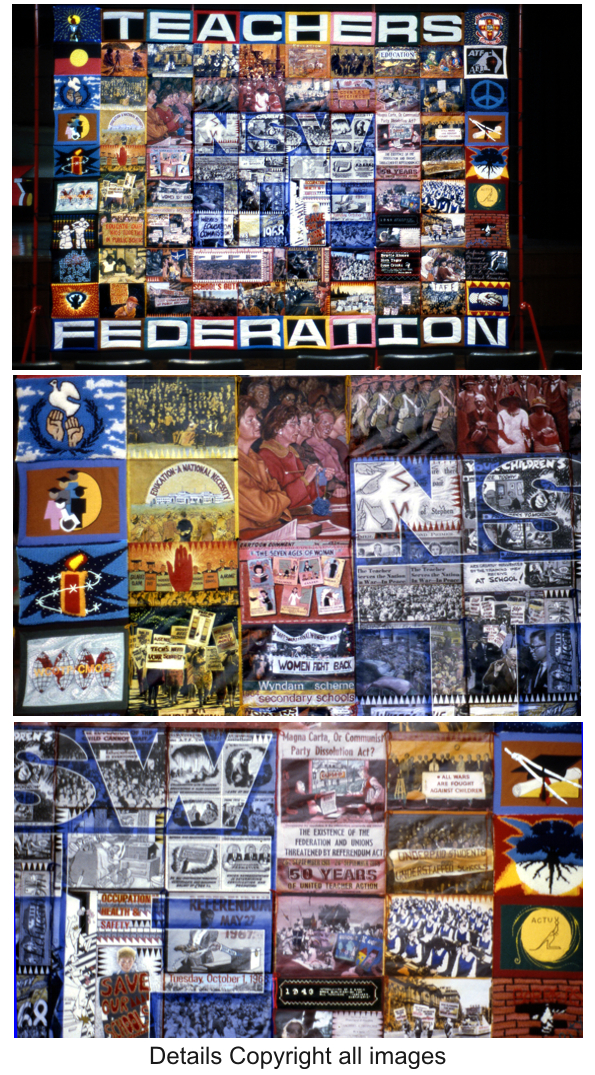
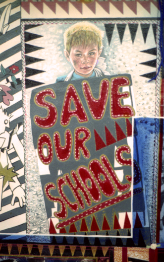
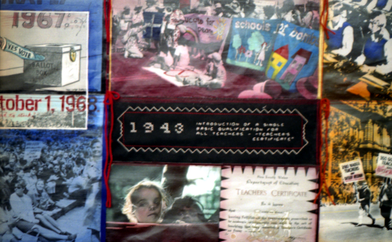
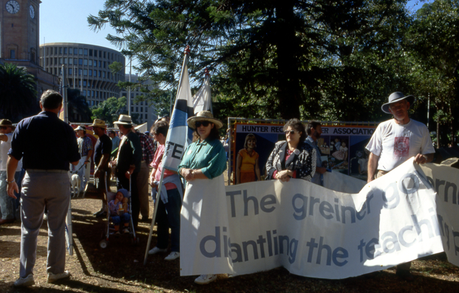
1989-90 "N.S.W Teachers' Federation". Mixed media Doubled sided. Fabric, knitting embroidery,patchwork,hand coloured photographs on canvas, and hand painting. 3m x 4m. co-workers on this project.Suzie Crook (Knitting) and Nola Taylor (textile) Fabricated on site at the federations Sydney's' office.
We worked mainly with Paula Block,I lived in the union flat over looking Darling Harbour and we worked at the Sussex St union offices.Due to their publications and extensive filling system I had access to many very good images.I was seduced by these. I have always loved quilts and with the skills of my co-workers the design I came up with incorporated all these aspects. I used heaps of photo copy's pasting playing till a final idea cemented itself. This banner brought together a wide variety of skills and I felt very supported and excited at our results. I started with Aboriginal teaching to the present time of the state liberal government and the minister of education - T .Metheral were creating massive public demonstrations to support the federation against them.. Jenny George was the secretary during this period This was a defining moment for this union and these images finished the time board ..You don't often get a opportunity to work on such a extensive and variety project.or with such rich materials.
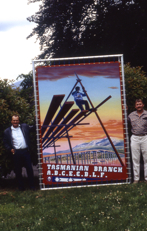
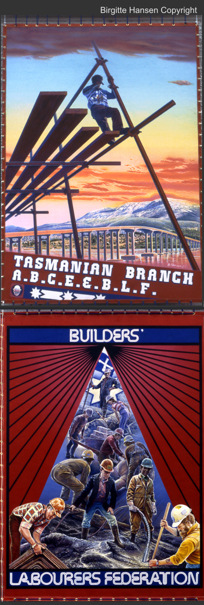
1987 "Builders' Labourers Federation" Hobart, Tasmania Double sided
During 1986 I was working at my peak.I was confident within myself, working extraordinary hours, 2-3 projects on at the same time. I accepted a contract in Hobart, Tasmania to do a banner for this union. The short version was within a week of arriving with my teenage son and new boyfriend in tow, we went out to listen to music. The cover charge was too expensive and I turned to go back down the stairs. My foot caught in a lip and I fell down the steps. After 2 months of agony and doctors not finding any problems I was finally scanned and found I had fractured my spine and very close to being paralyzed. A operation followed. I somehow finished this banner and this coupled with poor communication and hostility from 3 other artists working on fabric banners at the same time makes this the nightmare banner.Though the trainee Grazia Tucceri was very supportive at a cost to herself. The main person was obsessively maintaining her own territory for fabric only banners. I encountered a level of cruelty that today I still can't forgive.The only thing that made them happy was the sunset sky was not Tasmanian colours. I went for 3 months and it took me 9 months before I returned (minus boyfriend) home a different person. Jim Bacon (Future premier of Tasmania) the then secretary of the union was a saving grace. Under the circumstances I was proud that I finished this and the idea and quality was maintained. I was locked away in Risdon as the Federal elections were on and the opposition were making a lot of noise about arts funding to the BLF and I was working in a marginal labor ministers' seat. The photos' were taken by Andrew Cotton from a previous BLF project.
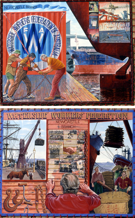
1988 "Waterside Workers Federation". Double Sided. 1.8m x 2.m Artist in resident program for Trades Hall Council. I supervised a full time trainee,who painted a banner for the "Australian Metal Workers Union (AMWU)" banner - Upper Hunter. Artist - Alaide MarcelI. Which I did poorly as I was still not well after Tasmania. I painted this banner in a lunch room over looking the loading wharf in Newcastle. During the Bicentennial Celebrations Queen Elizabeth's ship was moored right under my window.I waved. .A decision was made to have the history of the union up until 1967 on one side of the banner and contemporary images emphasizing containers on the other ... I designed the old side of the banner with three equal sections. In the first I made a window for the old scene. In the middle I constructed the inside of a shed with leaflets, union history and newspaper clippings collaged on the old wooden wall with a man reading the material and symbolically breaking the chains of his repression. An open doorway looks out onto a scene of men working. The modern side was more pragmatic, the work force were working in well paid positions and the romance of the industry had diminished. large numbers had been retrenched with new technologies in exchanged for better conditions. Watching containers being loaded was boring. The waterside union had always been a strong and clannish union, a mastership culture surviving in suburbs around the docks. I also
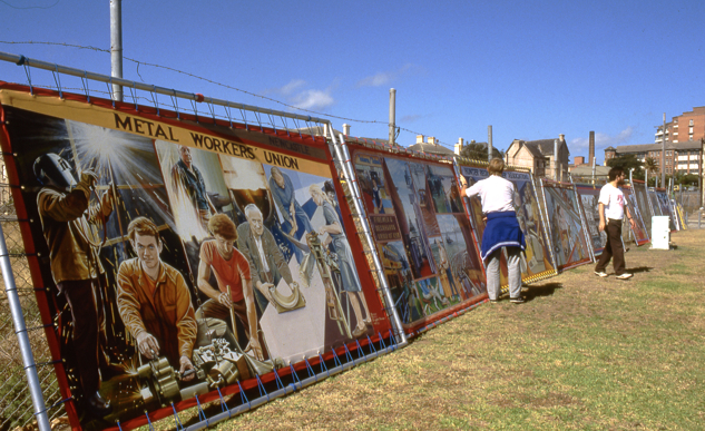
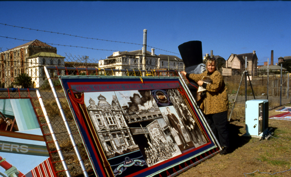
1988 "Federated Engine Drivers and Fireman's Association".Mining division,Muswellbrook, Double Sided. 3m X 2m. It was composed out of 34 separate photographs taken by union member, Russell Marlowe from over fifteen worksites in the Upper Hunter.The first grant application was rejected but Terry Paget who drove this from start to finished started on a fund raising drive. A"stripper night" night for the boys brought in some dosh and again a grant was applied for and this time it was successful. I was driven all over the Upper Hunter to all members to research and photograph members. I climbed colossal machines learnt all about "cats" saw and recorded this industry. Today I still have 3 books I put together of photos from this time, a mini record. One memorial trip had 3 "boys" and myself go west to gunnidah. I was set up with a huge seafood platter and drink and drink. I was so drunk I walked into cupboard thinking it was a loo. Next morning we had to leave early and the hang over and flickering light of the sun through the trees was torture.A blokie industry - they had had one female but said she was a scab,and I was not allowed even to make the child,a girl, not truthful.This union was very close knitted and very proud of the finished banner.
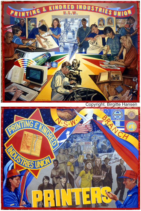
1991 "Printing and Kindred Industries Union". Double Sided. 2m x 2.5m. Sydney. This was fully funded by this union. I commuted to Sydney to do this banner. Down on the trains then to be driven out to worksites.I became caught in one of Sydney's worst storms one night and I had to stay for a morning appointment. I was soaking wet and it was pouring down so I went into the nearest hotel. It was the dirtiest doss house I'd ever stayed in. Someone had defecated on the shower floor, I waited till the rain had stopped and spent the night walking Sydney and sitting at Central Railway Station with all the other homeless people. The traditional use of chapels, mother and father of the chapel, terms to describe union organizers were uniquely still used.I personally related to the skill base of members and loved seeing the old presses, engraving tools and print sets. In one paint mixing factory the walls and floors where like a giant Jackson Pollock painting with a coloured man moping the paint of the floor. The industry was rapidly changing, new technologies were changing the skill base and amalgamations between unions were happening I remember how much against this the printers where. In the front side of this banner I was able to incorporate the old with the new . On the back I featured a old printer instructing a new female member on the history and the rules of this union looking back at some of the struggles and street marches. This was the last trade union banner I painted. 10 years. I have since read you get 10 years in art at a cutting edge, you go along at a frantic pace pushing yourself and developing ideas and becoming a expert then suddenly its over.
The change of government from the union friendly Hawk and Keating Labor government to the conservative Howard Liberal government swiftly put a end to the "Art and Working Life" policy of the Australia Council and I along with many other art workers around Australia had our careers and development in these areas retrench unfunded disappeared what ever you would have called this closure to this sort of artwork.I am honest enough to say that we had said a lot of what needed to be said at that time about working lives. I had racked my brains for new images and ideas and was in danger of repeating myself. In theatre productions again the stories were beginning to repeat themselves. The years that followed were lean ones for me, I had to reinvent myself ,eventually leaving Newcastle and moving to the mountains. I had 2 further opportunities to work in this field , In 1999 I did 4 murals along the lines of my banners for the closure of BHP steel in Newcastle and in 2006-7 I painted a 8m x 8m mural for unions NSW in Sydney Trades Hall. I found I was out of touch with recent developments in the union movement and I had to go through a steep learning curve.It had become much more corporate, suits were the order of the day, and rules governed behavior. The unions run under a much stricter Federal Liberal anti union Government rules, the unions "Right to Work" Campaign was under way and this helped elect a new Labor Government in 2007.
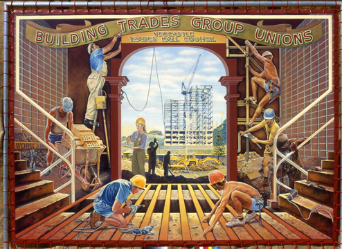
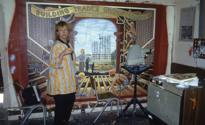
1987 "Building Trades Group's" Banner. Newcastle (2.8m x 1.5m.)
This banner was one-sided and I would describe it as "Post Modern" or "neo-classic" - it featured the emblems and structure of nineteenth century trade union banners but with modern images. Thus columns are replaced with scaffolding and draped Grecian styled women with workers in hard hats and overalls. This was a different banner project in that the artist and arts officer negotiated with four different unions (with four very different sets of ideas) as to how a single banner could depict their members and be at the same time visually striking and uncluttered.I again used the air brush technique to achieve a under painting. One issue for union officials was not to have anyone recognizable !!! so it meant some funny head gear or angles chosen. The women in the middle has a face. small victories. I did the design in the offices of this union under the watchful eye of Bob Cochran .Sec. Builders union. And he was a hard task master. and we were very different people but both willful. All the ideas I was coming up with he hated. I was despairing, my brain was empty till I came across a old photo of a archway with a builder slinging some rope. The image appealed to me so using photographs already taken I started to experiment and fill it in. As I was working in the office i was able to resize photos on the photocopy and cut and paste to my heads content. In Australia the reward was to have the Building Trades Group banner reproduced in the highly respected publication -
'Australian Painting 1788 - 1990' by Bernard Smith with Terry Smith
Oxford University Press, 1990 (pages 484,485).
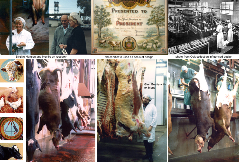
1989 Australasian Meat Industry Employees Union (AMIEU) banner (Double sided.)
For this banner Glen and I spent days visiting and photographing a number of worksites which we inspected including the Oak and Singleton Dairy Co-operatives, abattoirs at Aberdeen and Singleton, Steggles Chicken Processing Factory, a Coles Supermarket and two small butcher shops.we visited and saw the last day of cheese being produced at SIngleton Dairy Co-operatives. The slaughter house and its carousel of death was firmly etched in my mind. The design was developed through meetings with delegates representing all aspects of the worksites. One side of the banner was based on a historical certificate and the unions emblem. The other side was designed around the concept of a factory conveyor belt .I saw a lot of blood and watched a cow being fully processed from coming in live to death and being processed to all meat products to seeing where the left overs are processed. It was not enjoyable, very confronting, walking around in white coats and hats on floors covered in blood, trying to never slip. This banner disturbed me and how to paint food and death in a honest way. I did collect some very charming photo copies from Oak dairy from the days when displays where important, like
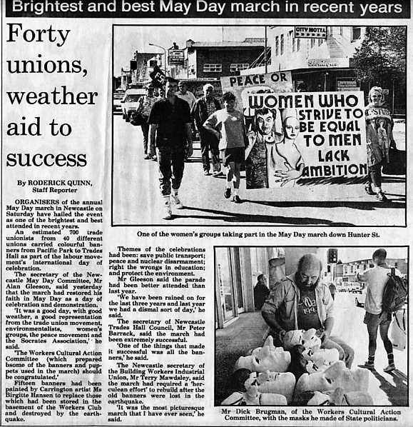
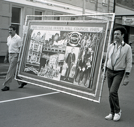
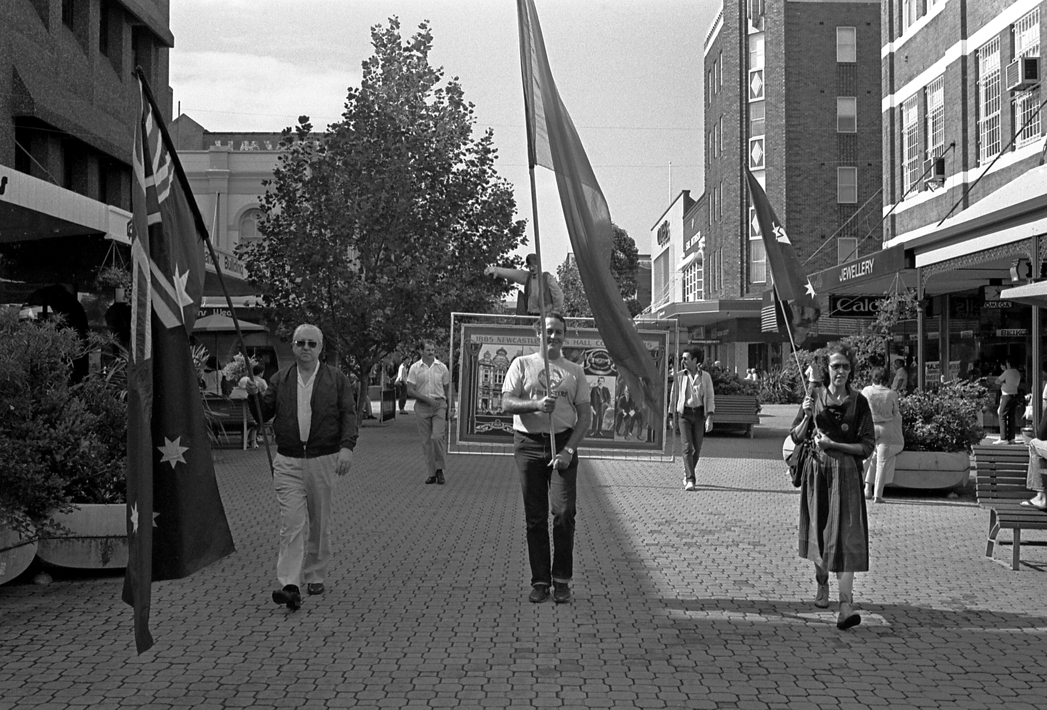
1985 "Newcastle Trades Hall" Centenary banner Double sided. 2.8 x 1.8 m.
The Centenary banner was a coalition of ideas and discussion between the artist and the NTHC Centenary Committee. Conceived as a two-sided banner, one historical, one contemporary, the banner was completed for May Day and headed the march that year.
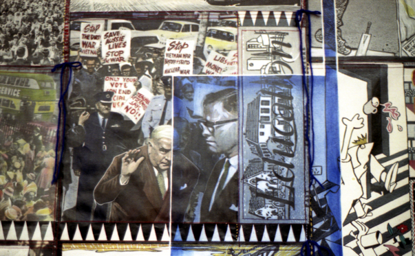
The banner was designed to show aspects of the sometimes turbulent history of Newcastle Trades Hall Council. This was captured through the use of archival images such as the old Newcastle Trades Hall built in 1895, a picture of the Operative Bricklayers, Newcastle Branch, with their banner featuring the Newcastle Trades Hall Council building, an Eight Hour Day symbol, an early picture of BHP, an old trade union symbol of two hands clasped in a handshake with the words "United to Protect, Not to Injure", a portrait of mining official, Peter Bowling, and a march of unemployed men in Cessnock during the Depression.
"I tried to execute the contemporary side of the banner in three panels. The first covered the old
technology and the new - a man in an office with computers and new technology inside
My personal life under went major changes during 1983-4, after 14 years of marriage I separated and divorce Allen Chawner and I was the mother and provider of my son Simon, aged 13 years and making a living became paramount. I continued to live in 2 conjoined 100 year old shop fronted 2 story wooden houses. One side was unlivable but used as a studio - storage and the other side was living quarters. I was young and the next few years was spent painting and being successful with grants and big projects. Murals, banners and teaching. After the success of the first banners another round of banners was financed and I moved into the bloom of my banner career. My technical skills expanded and I was able to explore more complex and exciting union banners.

Banners Two
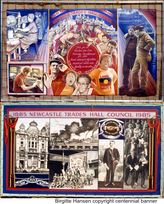
a symbolic TV screen being tuned by hand. The central image is a circle with slogans such as Unity is Strength suggested by the NTHC Secretary. The people around the circle are portrayed as sympathetic and symbolic to show that unions protect their members and are made up of people of all kinds - workers, aborigines, women, the aged, the young. The people graduate back in perspective to illustrate different issues since the Second World War".
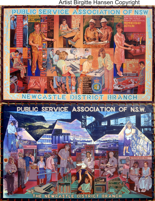
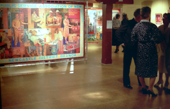
1986 "Public Service Association" (PSA) banner Newcastle District Branch
Double sided 1.67 x 2.8m The banner for the Public Service Association was double-sided and depicted members of the union engaged in a wide range of work - social workers, surveyors, occupational therapists, millwrights, clerical workers, parking patrol officers, teaching assistants, park rangers, librarians, laboratory assistants etc. Over twenty workplaces were visited as part of the research and union members chose all of the images on the banner.With the back of the deckhands banner and this one i was rapidly expanding my imagery and trying out new ways to design and paint. My life had settled down and I was constantly working and painting. The pearl like colours and luminosity of the cool side and using graphs as my compositional tool reflected the nature of the work of Public servants. The warm side was first air brushed in yellow to red in a circular motion which I then used as my mid tone. This technique which I'd come up with on "The Peace Banner Project" gave a unity to the images and I was able to stop using "systems eg Golden Mean" to achieve this. Photography, Jane Brisly - Birgitte Hansen.
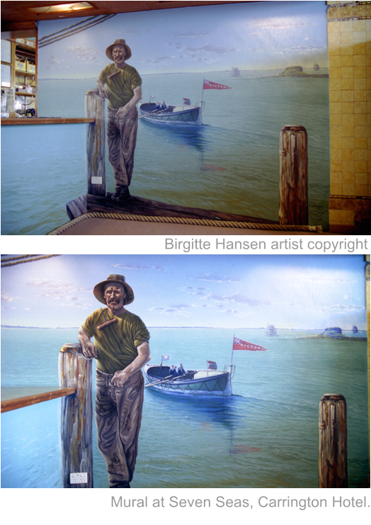
painted a small mural at the "seven Seas" pub at Carrington based on a wharfie and the old harbour. I repainted it in 2008 , was not paid and then watched it disappear behind panels for a tab facility for gambling.ironic. I chose a predominant orange and blue colour scheme because blue is the union's colour and orange is found on many ships, containers and old sheds and gave a complimentary contrast. Containerization was an enormous change in the history of the union. The workforce in Newcastle went from 1600 employees in 1967 to 200 now. The industry is now very mechanized (eg. container loader, coal loader, lift trucks and computers). Bill Kent, the union secretary, wanted the union's symbol on this side. I incorporated it as part of a container. I placed three workers in front, again with the symbolic chains, and used a photograph for the ship on the right. It was painted in a symbolic mode with realistic and abstract qualities combined."photography - B.Hansen - J. Brisley

Images from these years, people involved, May Day Marches
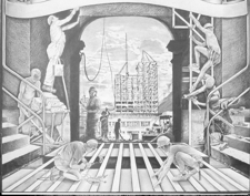
Drawing of finished design for approval by unions
small tabloids form the 1950's. No, I am still not a vegetarian but it was close. Photographs - Glenn Beaty - B.Hansen
link to Teachers Federation extra photos details of banner artists.
Meatworkers union extra photos
F.E.D.& F.A..extra material
Click on any image to enlarge
detail FEDFA banner
Mural at Seven Seas Hotel Carrington - Waterside Workers banner link
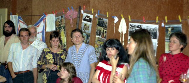
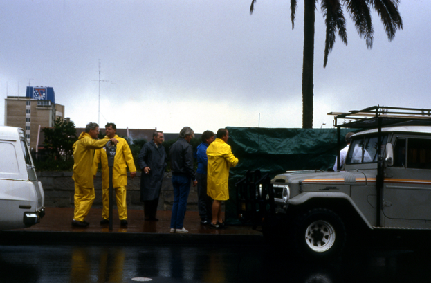
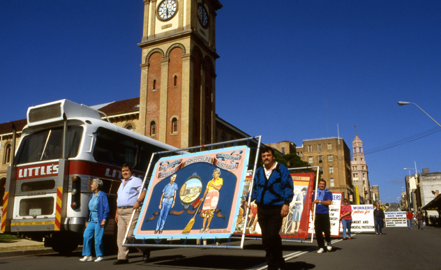
Waiting for May Day to start. 1990
detail FEDFA banner
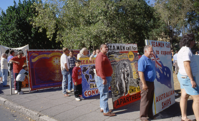
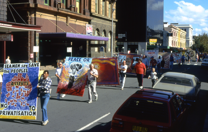
Single issue banners and naming banner 1990
Outdoor Gallery. End of May Day March
opps poor taste banner in march, to tired excuse. me on right
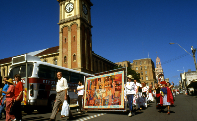
Peter Barrick, Sec Newcastle Trades Hall Council . Centennial May Day march 1985
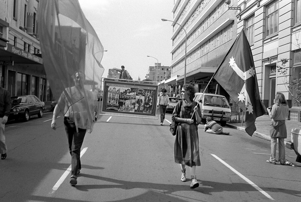
Centennial May Day March 1985
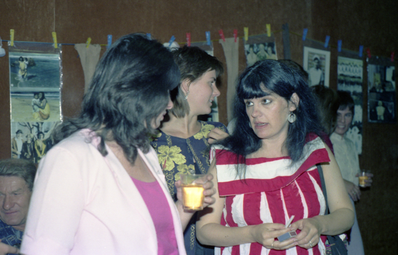
D.Mills Australia Council.Jane Brisly, Laurel Quillan, Workers Cultural Action Committee
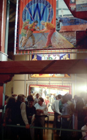
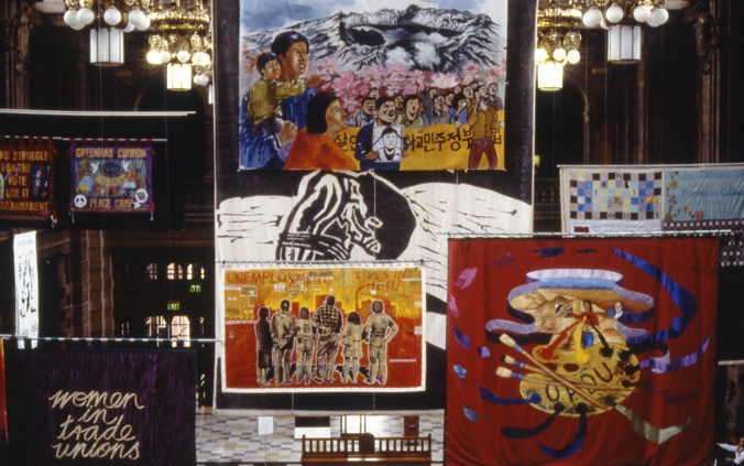
Banner Exhibition at Newcastle Regional
Gallery. Opening night - above and left
Some members of the workers Cultural action Committee. Opening of "A Womens Work Is"
Above more details from 1989-90 "N.S.W Teachers' Federation".
Nearly lost the banners on a wet day.They had been wrapped in plastic to protect from rain, but the plastic had lots of old acrylic paint stuck to it and when it became wet it loosen and stuck to acrylic of banners. a dramatic time removing the paint.
Friends used to jokingly call May Day March; Gitte March
May Day March.You can just see Gabrielle O'Connor's sculpture of a miner at back .The route was reversed so now the march went from Civic Park to Pacific Park
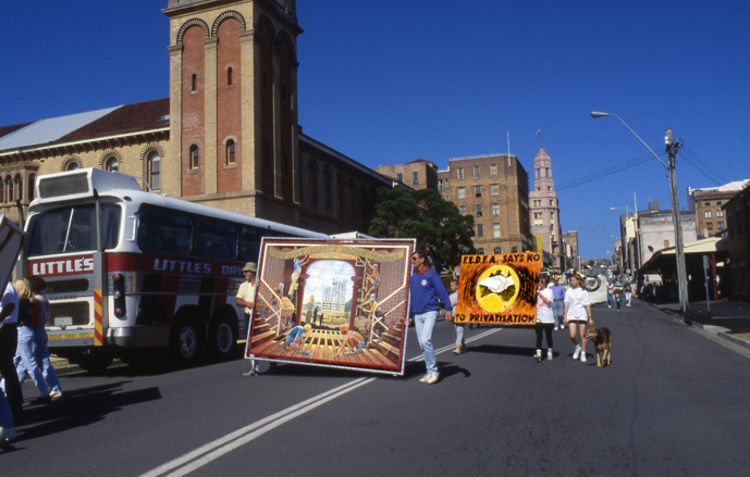
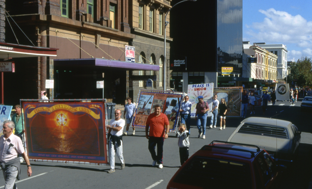
May Day March.Building trades Group banner and 1 temporary single issue banner .This March is Probably 1990
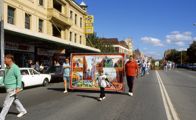
Firemen and Deckhands in same march
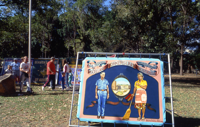
Miscellaneous Workers Union banner
photographer of march;Roger Broadbent
"Banners of the world" The Contempory Art of Banner Making.McLellan Galleries, Glasgow. 1992 an exhibition organised by Glasgow Museums and Art Galleries. Scotland

catalogue of exhibition complete
I love to use my Skills to relate and portray multi-layered visual stories. My range of mediums and practice's with examples of my work are displayed throughout this site. Murals are my speciality. Figurative work, genre, landscape, natural and industrial. Large scale paintings. Trade Union banners. Enduring environmental art-design - Conceptualized and site specific community based art work - Paintings - Portraits, public, family, business and community stories.Collaborative team work. Being a supervising artist on Public art projects.Hand painted ceramic tile murals.I am able to work to the design brief and budget constraints when working with clients,communities,architects and interior designers.I have renovated 4 houses incorporating various paint techniques,ceramic tiles,door features,color co-ordination, murals outdoors,ceilings,walls. Mural consultancies, working with communities vie the Internet,helping with design,mural elements and fabrication techniques while the client works with their own artists to produce the mural on site is a new service. Adult+children's art classes are now on.
All images and stories by Birgitte Hansen are copyright